My evaluation for the OUGD203 submission analyzing my progress throughout the brief and the skills I've developed.
Friday 25 May 2012
Product Range Distrbution // Final Pieces
Below are my final boards for submission and my final pieces, My boards reflect the overall outcomes for the brief and final piece consists of a 5 page poster pack.
Product Range Distrbution // Illustration & Publication Development
Blizzard


Mark Grist


Lunar C;


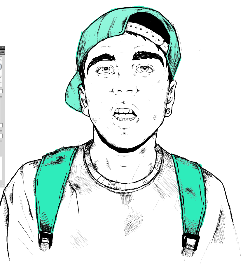

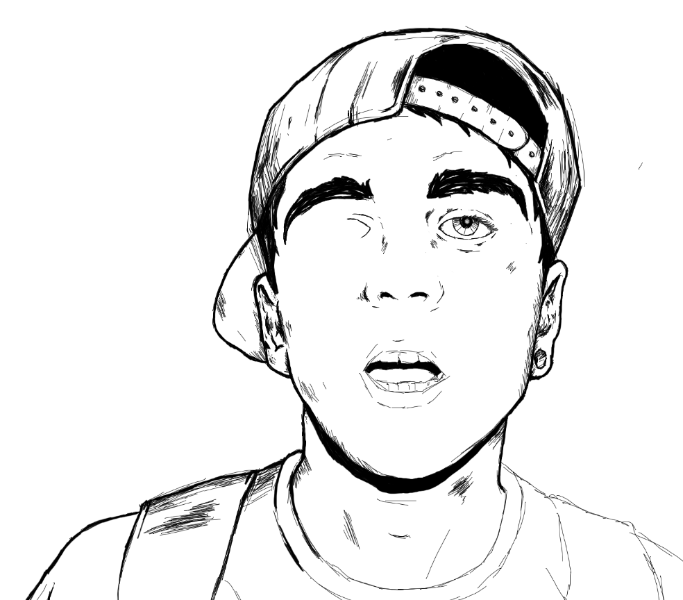
I really wasn't too happy with the eyes at this stage I ended up deleting about 10 different layers trying to get the shape of the pupils even and the oval of the eyelid balanced. As you can see above in comparison to the photo's below the eyes have much more impact and bring the face to life a bit better.


Matter


Product Range Distrbution // Further Logo Devlopment
Below some further developments of the logo for Don't flop, I'm trying to stay consistent with their previous branding having the D and the F inter weaved but I'm not too sure what feel I want the letters to have. These screenshots show some of the visual ideas I've generated, I think the flicks on top of the letters give them a lot of character, with the finer border I think this would be ideal for a clothing range swing tag.


Using the same typeface Nevis Bold I've produced a few more sample below, making minor modifications to the structure of the letters just to try and make the title more visually intriguing to read.


These are some Ideas I began to experiment with just taking a simplistic idea from some doodles, I think the banner works really well purely because its easy to digest on the eyes as it's only made out of three shapes. I want the logo to be crisp and instantly recognizable and I think the simplicity of the banner elaborates this.


A couple of samples without the wings of the banner, I've tried to stick with a clean cut easy to read logo, I think it works with both the added side panels and without.


A mix of Colours, Some a bit to sharp and clashing.


Crest Experiments;


Below is a document I put together with the logo I've finalized, I think overall I'm going to come to a conclusion with the branding and stick with this logo, I've made this decision solely down to it be very universal, I can see it working well across a range of products.
