<html> </html>
<title> </title>
<body> </body>
<head></head>
Head tags include all the information that is not visible on the webpage, the functions and instructions for different aspects on the page.
Div means division, its how you lay a website out in terms of boxes etc.
CSS - Cascading style sheets
When creating a website, it is essential to create folders with lowercase titles and no spacing. This will be constructed from a root folder containing a folder called images.
Always make the coding as simple as possible to understand.
Position new tags on a separate line, keep different tags on new lines.

CSS
Apply attributes to the body- When working with simple text functions, typing the word body alone with a space and then a curled open brack brings a drop down of the default animations.
CSS is always placed within the head tags, as it contains information on the functions of the page rather than the content itself.
Indenting tags, separates out linked pieces of html.


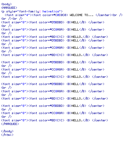
<MARQUEE>
<p style="font-family: helvetica">
<font size="4"><font color=#C0C0C0> WELCOME TO... </center><br />
<br /><br />
<font size="8"><font color=#D5BDBD> <B>HELL</B> </center>
<br />
<font size="8"><font color=#CC8A8A> <B>HELL</B> </center>
<br />
<font size="8"><font color=#BD1C1C> <B>HELLO.</B> </center>
<font size="8"><font color=#D5BDBD> <B>HELL</B> </center>
<br />
<font size="8"><font color=#CC8A8A> <B>HELL</B> </center>
<br />
<font size="8"><font color=#BD1C1C> <B>HELLO.</B> </center>
<font size="8"><font color=#D5BDBD> <B>HELL</B> </center>
<br />
<font size="8"><font color=#CC8A8A> <B>HELL</B> </center>
<br />
<font size="8"><font color=#BD1C1C> <B>HELLO.</B> </center>
<font size="8"><font color=#D5BDBD> <B>HELL</B> </center>
<br />
<font size="8"><font color=#CC8A8A> <B>HELL</B> </center>
<br />
<font size="8"><font color=#BD1C1C> <B>HELLO.</B> </center>
<font size="8"><font color=#D5BDBD> <B>HELL</B> </center>
<br />
<font size="8"><font color=#CC8A8A> <B>HELL</B> </center>
<br />
<font size="8"><font color=#BD1C1C> <B>HELLO.</B> </center>
</MARQUEE>
When saving files for web and mobile devices don't just click save as in photoshop etc. Always select save for web and mobile devices. Select PNG 24 to create an image with interlinked layers, allowing images to retain their transparency. The smaller the file, the better as webspace costs money plus the speed of your webpage loading will be judged on the amount of memory it needs to load.
A couple of my first attempts of putting together a basic webpage layout;