Wednesday 28 March 2012

Dreamweaver Workshop 1 : Web Seminar

When designing a website all of the initial stages are completed by hand and not on screen, Its the preparation that makes a successful piece of design not just the making of.

Purpose;

-To showcase work
-To get further work
-Employment
-Freelance

Target Audience;

-Design studios
-Co-operative clients
-Events and exhibitions
-Independent buyers
-Co-laborators
-awards/like minded people

Audience Needs;

-Work Examples
-Contact Details

Things to look for when buying webspace: Unlimited Bandwidth/FTP
A company based in the U.K one.com

A few examples of successful and simple, open planned websites;


 When  working with design for web there are only a select amount of colours to work with. These are called web safe colours, and are represented with a hexadecimal code. 

Adobes Kuler Website is perfect for selecting colours that are safe to work with web.


 For next sessions find a series of websites that inspire you and make some notes on them, work out why the website is good, how the navigation works, what content does it hold? Is the design effective, and does it communicate well? Draw up some initial drawings for you own website and put together a minimum of 3 scamps.

Tuesday 27 March 2012

FEDRIGONI // Personal Submission Boards

The personal Submission boards for OUGD203, analyzing what I specifically did within my group to solve the brief.

FEDRIGONI // EVALUATION

The evaluation for YCN;


FEDRIGONI // Final Boards for YCN

Below are mine and Simon's Group Boards for the YCN Submission along with evidence of our upload;


Monday 26 March 2012

FEDRIGONI : Language for the YCN Boards

LANGUAGE

For the YCN hand in we want to perfect our boards even further, sticking with a consistent tone of voice and telling the story of our resolution from start to finish. Below are some key outlines of what we want to have on each slide.

Its going to be important to check through at least a week or so in advance. We need to make sure that they are easily readable but still visually interesting.


Slides;
1: Our intentions/concept/plan to make fedrigoni amazing, bring it back to life, (couple of the birds poking into the frame of the page)

2: Promotion for event, story of fedrigoni, ( comparison to the bird) Creative Review advert, other online promotion mock up.

3. Mailout (envelope shot, tickets + fold out) 3 photograhs, talking about how they would be recieved + linking in with our event.

4. Bird posters + other event material. Talking about how they event would be associated with imaginative colours.

5. Mock ups of event, window shot, and installation shot. Talk about sessions with andy singleton. Paper as a form of media and how its exciting current and shouldn't be lost to the digital age.

Saturday 24 March 2012

FEDRIGONI // Creative Review


IMAGE // D&AD : Final Result

I'm quite happy with my final result. I worked with the positioning of the layout in Indesign, I felt that the white boarder of blank space gave the block in the middle a bit of definition. It sat nicely on the page so I thought I would go ahead and stick to initial gut feeling, I don't want to over complicate things too much, therefore I think it works on its own.

FEDRIGONI // Mailout

FEDRIGONI // Creating the Identity.


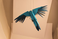
The identity for our Fedrigoni range is derived from some research I did into Fedrigoni as a company and where they're based In the world. The Italian Bee eater is a common bird to the area of which they're paper mills operate in Italy. A bird communicates freedom, and we wanted to communicate that paper is a free form type of media. Based on some research into paper craft I produced made this bird below.


I made a net on Illustrator to map out the wings, and then used a selection of three different blue stocks to give the feathers some sort of colour range and depth. I'm really happy with the results, It took a while to crack but I'm really happy I finally perfected the style we were aiming for.

˚˚˚˚˚˚˚˚


IMAGE // D&AD : More Manipulation

I've picked the final Image I think I'm going to pursue my Idea with, Its the most interesting to look at whilst still being readable. I've colour half toned the Image and Played around with some colour ways, however I think I much prefer the design in plain black and white. Below is some screenshots of my development.


IMAGE // D&AD : Further Devlopment

 Below are a few digital manipulations of my photos. I Tried a couple in colour and a couple in black and white, I found that raising the exposure and dropping the gamma levels gave the surface of the water a much more toned and 3d feel.


The close ups of the type itself look work well visually, I've played around with the threshold making the image purely black and white but the characteristics of the ripples are lost.


Overall I think the image works well on its own, I don't think any more manipulation needs to be done. However I don't think I would have the image filling the full A2 format we have to work with.