Monday 31 October 2011

Grahams Type Session 2

Type workshop

Kerning- The space between 2 or more characters.  The area that lies in-between. Making our diction sound gorgeous.

Why do we need kerning?...To insert a consistent white space in-between letter forms.

Letter spacing and kerning is literally making a set of letter sit comfortably on a page by altering the white space in-between a set of letters in a word.

In terms of branding kerning has to be perfect because one word logo’s need to attract the attention of custom.

When editing kerning you start with is the space which is the largest space in between two letters in word.

Hierarchy – Visually communicating information in the order it is intended to be read.

A system or organization in which people or groups are ranked one above the other according to status or authority.

The eyes work separately to your brain when reading, You don’t necessarily view something how you think it to be viewed, don’t let your eyes kid yourself.

You eyes are firstly draw to words on a page that have the most negative space around them.

It is impossible to look at your work for more than 10 minutes without going crazy in your own mind, thinking words are spelt wrong etc, Make sure you get someone else to check through.

Task-Write down a line from your favorite song, and arrange it how you want it to be read.

How do you break a sentence into two lines?

The rule of breaking a sentence, you always break the sentence where the natural pause is always speak a sentence out loud before attempting to break it.

TASK


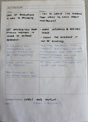
Feedback Sheets

After presenting my four concept boards I was given heaps of feedback to move my project forward.


Main points Brought up;


- Think about Promotion so your specific audience can find the product you're promoting.

- How will I distribute My product?
- Possibly consider pantone matched spray cans.
- Sale display with information on the product you're selling.
- Print info on cans.
- Broaden your idea.
- Inform in store.


Action plan and Peer Feedback Sheets


Main Points Brought Up;
-Try to grasp the audience that want to know about the process you're informing.
-More informed and refined source.
-Shows the audience it can be achieved.
-This will broaded your market, also new users to graffiti are the least knowledgeable so will want to know more.
-To see what you can get away with doing.

4 Concept sheets

Below are my four concept sheets outlining my rationale and aims for my work so far ready for crit. My four main points for each sheet and links to contextual references from my sheets are listed below.

5 reasons why Spray paint is good.

1.Spray paint is a very durable media that will cover almost any surface or material. This doesn’t limit the amount of places spray paint media can be used un-like more common types of media such a pens pencils etc.

2.Coverage, the characteristics of spray-paint allow you to cover a big area in a short amount of time, unlike a brush and a roller spray paint is projected from the can by pressurized gas.

3.Spray paint culture and its associated cousin graffiti, entitles its users to a freedom of expression and an outlet for creativity. Anyone can pick up a spray can and get out there.

4.The colour possibilities are endless; spray paint comes in an extremely wide range of tones and shades that you usually wouldn’t be able to acquire.

5.Its simple and effective to use, you need a can and a cap, no paintbrush, oils, easel or palette, spray paint is quick and ready to go.

Initial Ideas

1. Branding and Identitiy- To design and produce my own series of spray paint, including promotional flyers and leaflets to advertise my product. This would include creating the housing for my spray cans and a series of nets that would remain consistent.

2.to create a booklet/panflet that gives inexperienced users of spray paint a guide to brands of paint and spray can caps. Giving them the ability to understand different techniques within spray painting and how to control the can properly.

3. A guide to walls
4.Paint swatch guide, what colours work best


Tuesday 18 October 2011

My other 2 nets....


My final package consisted of the same concept of as my envelope net, using acetate to create a see through window. I want this package to house a spraycan when enlarged therefor my acetate window will will expose the can inside.


Designs for my nets...

I want to keep each of my four designs unique and considerably different however to keep them consistent I've decided to use my logo I've created as a repeat pattern.  This will tie all my pieces of packaging together.

I wanted to keep the net below as simple as possible as I thought the only product that it could house that would relate to my project is some sort of fold out leaflet or guide. I wanted to use a light grey stock when It came to print with my repeated pattern a darker shade of grey that it would fade into the colour of the stock. In the centre I decided that a more easily legible and readable logo would need to be placed, That way It would easily inform the user without them trying to depict the pattern I've made out of my logo.


Below are a few images of my final print out, I'm quite happy with my final result, I think the repeat pattern worked exactly how I expected. However I wouldn't mind using a series of different colour stocks but using the same design. I printed a few different versions of the design below and modified the positions of the logo in the centre, I found that having the logo in the bottom right hand corner looked much more subtle than having a huge logo in the middle.

 I thought the envelope net could be used to house my spray can cap guide, using the front as a see through window for the information to be seen through. I would achieve this by using acetate to create a little see through window in the shape of the top of a spray can. I thought this would be a good device to refer to what will be held inside. 


 This is my final print below, I think the acetate window will work well when there's content inside the envelope to present. I'm happy with the change in colour scheme, having the repeat pattern two shades of gray makes the package seem much more appealing.


Nets...


The four nets below are the nets I've been given to work with. I've made digitally versions of them in illustrator ready to start generating ideas.

Sunday 9 October 2011

Making My logo Vector...Experimenting with colour and positioning


After getting a good idea of what my final logo is going to look like, I started to play around with colour and the positioning of my logo. I found that the letters slotted together well as a set, this could be a good theme to work with if I need to create a background or backdrop. In regards to colour we have a limit of 2 colours, so this is something that will need to be taken into consideration greatly. My aim is to use a light stock when printing so that the characteristics of the paper show through into the print and the colour of the stock can act as my third colour.

Colour Variations I think I may use...


Whilst working on a few ideas of what colours I would like to use, I started playing around with drop shadow. This colour could be made up from my choice of stock plus it really helps to lift the logo from the area its been placed.


Making My logo Vector Final Ideas.

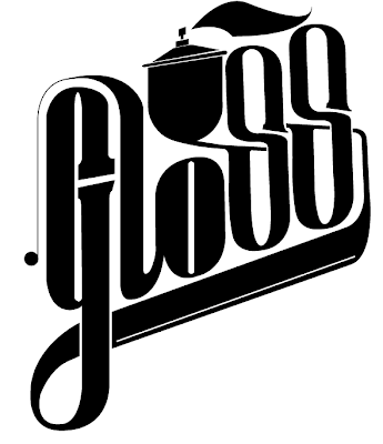
A few of my final ideas towards creating a final logo for the branding of my project. I used the stem of the letter S to try and subtly create the image of a spray can. 


Making my logo Vector....

After sketching up a few final Ideas I decided to make my logo in Illustrator so that it would be nice and crisp for when I create my packaging. After making my logo vector I experimented with a few different techniques of jazzing my design up.